In early days developers used to create a responsive web design using floats, positioning or inline blocks.
Now, with the introduction of Grid layout in CSS, we no longer need floats, positioning or inline blocks to design a responsive webpage. As Grid provides rows and columns that helps developers to design a responsive page.
Grid layout in CSS provides rows and columns that can fit any screen size when the screen is resized.
A Grid Container is a parent element that can contain a set of child elements.
For an HTML element, when we set the value of display property to grid or inline-grid, the HTML element becomes a Grid Container.
There are two properties in CSS that helps us to define rows and columns for a Grid.
They are :
As said earlier, Grid layout contains rows and columns.

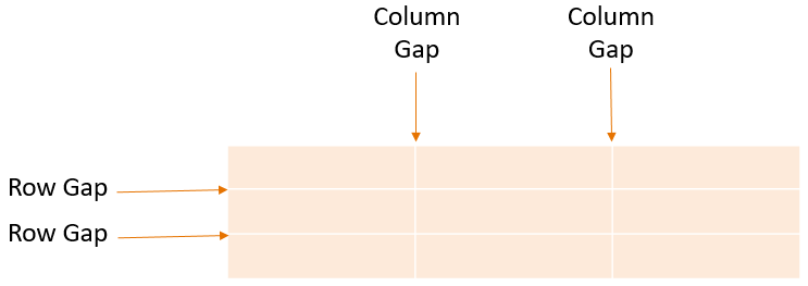
Now, the gap between rows is a Row Gap and the gap between columns is Column Gap.

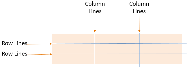
The lines that are between the Columns are called column lines and the lines that are between the Rows are row lines.

The Grid Track is the vertical and horizontal space between two grid lines.

Grid Cells are formed by the intersection of rows and columns.

A Grid Area consists of a set of Grid cells.

<html>
<head>
	<style>
		div.grid_container {
    		display: grid;
    		grid-template-columns: 100px 100px 100px;
		    width: 300px;
    		border: 4px solid;
		}

		div.grid_item {
    		border: 2px solid;
    		background-color: LightGray;
    		text-align: center;
		}
	</style>
</head>
<body>
	<div class="grid_container">
		<div class="grid_item"> John </div>
		<div class="grid_item"> Paul </div>
		<div class="grid_item"> Sunil </div>
		<div class="grid_item"> Prakash </div>
		<div class="grid_item"> Salim </div>
		<div class="grid_item"> Tom </div>
		<div class="grid_item"> Tina </div>
		<div class="grid_item"> Elena </div>
		<div class="grid_item"> Anjali </div>
	</div>
</body>
</html>
So, in the above example, we have a parent <div> element.
<div class="grid_container">
	...
	...
</div>
And nine child <div> elements for the parent <div> element.
<div class="grid_container">
	<div class="grid_item"> John </div>
	<div class="grid_item"> Paul </div>
	<div class="grid_item"> Sunil </div>
	<div class="grid_item"> Prakash </div>
	<div class="grid_item"> Salim </div>
	<div class="grid_item"> Tom </div>
	<div class="grid_item"> Tina </div>
	<div class="grid_item"> Elena </div>
	<div class="grid_item"> Anjali </div>
</div>
Now, to convert the parent <div> element to a grid, we have value of display property to grid.
display: grid;
And all the child <div> elements becomes a part of the grid layout.
The next task we have to do is, set how many columns would be there in the grid. And for that we have used the grid-template-columns property and set three values for it.
grid-template-columns: 100px 100px 100px;
Now, if you see the above output, a grid layout is set with three columns with 100px width.
Just like the grid-template-columns property, we can have the grid-template-rows property that would define the number of rows and its height in the grid.
<html>
<head>
	<style>
		div.grid_container {
    		display: grid;
    		grid-template-columns: 100px 100px 100px;
            grid-template-rows: 50px 50px 50px;
		    width: 300px;
    		border: 4px solid;
		}

		div.grid_item {
    		border: 2px solid;
    		background-color: LightGray;
    		text-align: center;
		}
	</style>
</head>
<body>
	<div class="grid_container">
		<div class="grid_item"> John </div>
		<div class="grid_item"> Paul </div>
		<div class="grid_item"> Sunil </div>
		<div class="grid_item"> Prakash </div>
		<div class="grid_item"> Salim </div>
		<div class="grid_item"> Tom </div>
		<div class="grid_item"> Tina </div>
		<div class="grid_item"> Elena </div>
		<div class="grid_item"> Anjali </div>
	</div>
</body>
</html>
So, in the above example, along with the grid-template-columns property, we have defined the grid-template-rows property.
We have provided three values for the grid-template-rows property.
grid-template-rows: 50px 50px 50px;
And three rows are set with 50px height.
The grid-template-areas property can contain more than one cell in a grid. And with those cells it can form a grid area
Say for example, a website can have a header, content, sidebar and footer. And we can use the grid-template-areas property to represent that.
<html>
<head>
	<style>
		div.container {
        	display: grid;
          	grid-template-columns: 150px 500px;
            grid-template-rows: 40px 100px 40px;

            grid-template-areas:
                "header header"
                "sidebar content"
                "footer footer";

            border: 3px solid;
            text-align: center;
            width: 650px;
		}

        div.header_grid {
            grid-area: header;
            background-color: Orange;
        }

        div.sidebar_grid {
            grid-area: sidebar;
        }

        div.content_grid {
            grid-area: content;
            background-color: LightGray;
        }

        div.footer_grid {
            grid-area: footer;
            background-color: Orange;
        }
	</style>
</head>
<body>
	<div class="container">
            <div class="header_grid">Header</div>
            <div class="sidebar_grid">Sidebar</div>
            <div class="content_grid">Content</div>
            <div class="footer_grid">Footer</div>
        </div>
</body>
</html>
So, in the above example, we have used the grid-template-columns property to create two columns,
grid-template-columns: 150px 500px;
And three rows using the grid-template-rows property.
grid-template-rows: 40px 100px 40px;
And finally, we have used the grid-template-areas to define the complete grid area.
grid-template-areas:
	"header header"
	"sidebar content"
	"footer footer";
So in the grid area, the first row has header repeated two times. And this header is defined in the grid_area property,
div.header_grid {
	grid-area: header;
	background-color: Orange;
}
And when the content of grid-template-areas and grid-area property matches, the style is applied based on that.
Rest of the grid area follows the same rule.
The grid-column-gap property specifies the gap between columns in a grid and grid-row-gap property specifies the gap between rows in a grid.
<html>
<head>
	<style>
		div.grid_container {
    		display: grid;
    		grid-template-columns: 100px 100px 100px;
            grid-template-rows: 50px 50px 50px;
            grid-column-gap: 10px;
            grid-row-gap: 20px;
		    width: 320px;
    		border: 4px solid;
            background-color: Orange;
		}

		div.grid_item {
    		border: 2px solid;
    		background-color: LightGray;
    		text-align: center;
		}
	</style>
</head>
<body>
	<div class="grid_container">
		<div class="grid_item"> John </div>
		<div class="grid_item"> Paul </div>
		<div class="grid_item"> Sunil </div>
		<div class="grid_item"> Prakash </div>
		<div class="grid_item"> Salim </div>
		<div class="grid_item"> Tom </div>
		<div class="grid_item"> Tina </div>
		<div class="grid_item"> Elena </div>
		<div class="grid_item"> Anjali </div>
	</div>
</body>
</html>
So, if you look at the above output, you can find a gap between the rows and column. That is because we have specified the gap for rows and column using the grid-column-gap and grid-row-gap property.
Let us understand, how can we set Column Lines in action with grid-column-start & grid-column-end properties.
<html>
<head>
	<style>
		div.grid_container {
    		display: grid;
    		grid-template-columns: 100px 100px 100px;
            grid-template-rows: 50px 50px 50px;
		    width: 300px;
    		border: 4px solid;
		}

		div.grid_item {
    		border: 2px solid;
    		background-color: LightGray;
    		text-align: center;
		}

        div.grid_item1 {
    		grid-column-start: 1;
    		grid-column-end: 3;
    		background-color: Violet;
		}
	</style>
</head>
<body>
	<div class="grid_container">
		<div class="grid_item grid_item1"> John </div>
		<div class="grid_item grid_item2"> Paul </div>
		<div class="grid_item grid_item3"> Sunil </div>
		<div class="grid_item grid_item4"> Prakash </div>
		<div class="grid_item grid_item5"> Salim </div>
		<div class="grid_item grid_item6"> Tom </div>
		<div class="grid_item grid_item7"> Tina </div>
		<div class="grid_item grid_item8"> Elena </div>
	</div>
</body>
</html>
So, in the above example, we have eight items in the grid container.
<div class="grid_container">
	<div class="grid_item grid_item1"> John </div>
	<div class="grid_item grid_item2"> Paul </div>
	<div class="grid_item grid_item3"> Sunil </div>
	<div class="grid_item grid_item4"> Prakash </div>
	<div class="grid_item grid_item5"> Salim </div>
	<div class="grid_item grid_item6"> Tom </div>
	<div class="grid_item grid_item7"> Tina </div>
	<div class="grid_item grid_item8"> Elena </div>
</div>
Now, for the first item,
<div class="grid_item grid_item1"> John </div>
We have defined the properties grid-column-start and grid-column-end.
div.grid_item1 {
	grid-column-start: 1;
	grid-column-end: 3;
	background-color: Violet;
}
The grid-column-start starts counting from the line number, column wise. In this case the value of grid-column-start is 1, so it starts from line number 1 and goes till line number 3(Since the value of grid-column-end is 3.
So, if you look at the above output, it takes two columns and prints John.
Same rule applies for rows using the grid-row-start & grid-row-end properties.