Just think, you have opened a webpage in your laptop and it fits your laptop screen. And when you open the same webpage in your mobile, it fits perfectly in your mobile screen.
And that is because the webpage has a responsive layout and is a responsive page.
A responsive page in HTML is a page that gets automatically resized when viewed in a laptop, desktop, mobile or other devices.
<html>
	<head>
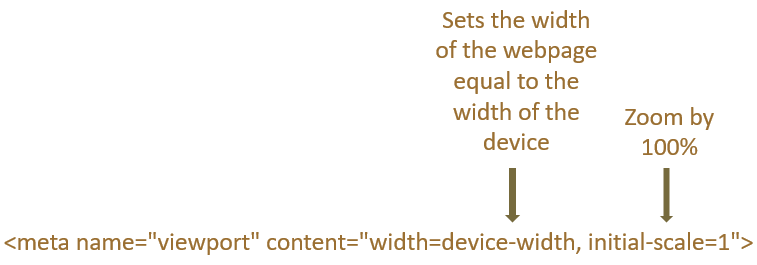
  		<meta name="viewport" content="width=device-width, initial-scale=1">
	</head>
	<body>
		<p>
			This is a responsive page that gets resized automatically.
		</p>
		<p>
			<img src="image1.jpg" style = "width:100%">
        </p>
	</body>
</html>
So, in the above example we have created a responsive page that gets resized automatically when viewed in a laptop or mobile phone.
And to make it a responsive page all we have done is set the viewport in the <meta> tag.

And the text in the <p> tag gets resized automatically.
<p>
	This is a responsive page that gets resized automatically.
</p>
In the next line we have the image which also gets resized automatically.
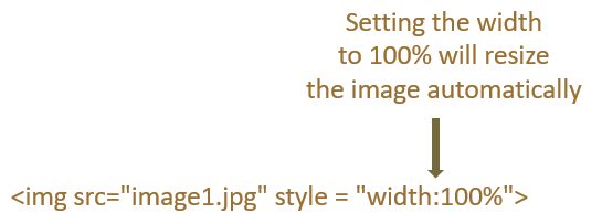
<img src="image1.jpg" style = "width:100%">
But we need to add an extra attribute to make the image responsive. i.e. We need to set the value of style attribute to width:100%.

And it will make the image fit the entire screen(Be it a mobile phone or laptop).
However, there are some scenarios where you don't want the image to cross its actual size.
In simple words, every image has a size and width:100% will zoom the image to fit it to the screen of the device.
Now, what if you don't want the image to cross its actual size. And that is where the max-width property comes into picture.
<html>
	<head>
  		<meta name="viewport" content="width=device-width, initial-scale=1">
	</head>
	<body>
		<p>
			<img src="image1.jpg" style = "max-width:100%">
        </p>
	</body>
</html>
So, in the above example we have set the max-width property to 100%.
<img src="image1.jpg" style = "max-width:100%">
And what happens is, the image will never cross its original size. However, the image can become smaller if your browser window is small.
Next, let us see how we can resize the text size based on the change of browser window.
HTML provides us with something called as vw or viewport width, based on which the text size will change with the change of browser window.
Let us see with the below example.
<html>
	<head>
  		<meta name="viewport" content="width=device-width, initial-scale=1">
	</head>
	<body>
		<p style = "font-size:15vw">
			This is a responsive text that gets resized automatically.
		</p>
	</body>
</html>
So, in the above example, we have set the font-size property to 15vw.
<p style = "font-size:15vw">
Due to which the text,
This is a responsive text that gets resized automatically.
Gets resized with the change of browser window.
HTML also gives you the flexibility to choose different styles for different browser sizes.
<html>
	<head>
  		<meta name="viewport" content="width=device-width, initial-scale=1">
	</head>
	<style>
		@media screen and (max-width: 800px) {
  			p {
    		color: red;
  			}
		}
	</style>
	<body>
		<p>
			The color of this text is changed when the width of browser is less than 800px.
		</p>
	</body>
</html>
To see the above example in action, resize your browser to less than 800px width and the color of the text changes to red.
This is because of the media query, @media screen and (max-width: 800px) we have set inside the <style> element.
<style>
	@media screen and (max-width: 800px) {
		p {
		color: red;
		}
	}
</style>
And when the width of the browser window is less than 800px,
@media screen and (max-width: 800px)
The color is changed to red.
p {
color: red;
}
Now, let's say there is a requirement where you will have to display different image for different screen sizes.
Let us look at the below section.
Depending on the width of the browser you can display different images. And thanks to the <picture> element that helps us to achieve that.
<html>
	<head>
  		<meta name="viewport" content="width=device-width, initial-scale=1">
	</head>
	<body>
		<p>
			Resize the browser to see different images for different width.
        </p>
        <picture>
  			<source srcset="image1.jpg" media="(max-width: 600px)">
  			<source srcset="image2.jpg">
  			<img src="image3.jpg">
  		</picture>
	</body>
</html>
When the width of the browser is more than 600px, image1.jpg is displayed on the screen.
And how is that so?
Let us understand the above lines of code.
We have a <picture> element which contains the <source> element.
<picture>
	<source srcset="image1.jpg" media="(max-width: 600px)">
	<source srcset="image2.jpg">
	<img src="image3.jpg">
</picture>
In the <source> element there are two attributes,
So, the attributes of the <source> element decides that when the width of the browser is less than 600px, image1.jpg will be displayed on the screen.