When you browse a website, you can find the information grouped into paragraph, images are grouped together in sections, there is a sidebar to help you navigate easily and so on.
Have you ever wondered how this is done in HTML. It is done using something known as the <div> tag.
The <div> tag helps you group a set of texts into paragraph, also it can help you group images and other contents in HTML.
Let us look at an example, with and without a <div> element.
<html>
	<body>
        This is a sample paragraph to demonstrate the use of div element.
	</body>
</html>
<html>
	<body>
        This is a sample paragraph <div>to demonstrate the use</div> of div element.
	</body>
</html>
So, in the example without the <div> element the text is printed in a single line.
This is a sample paragraph
to demonstrate the use
of div element.
However, in the example with <div> element the text is printed in three different lines.
This is a sample paragraph to demonstrate the use of div element.
So, if you look closely at the existing code, the text to demonstrate the use is inside the <div> element.
This is a sample paragraph <div>to demonstrate the use</div> of div element.
And what <div> element does is, places line break before and after the text, to demonstrate the use.
And thus we get the above response.
Now, just wait. Think for a second.
Don't you think <div> element is quite similar to the <p> tag? Let's take a look.
Let us rewrite the above example using <p> element. All we will do is, replace the <div> element with <p> element.
<html>
	<body>
        This is a sample paragraph <p>to demonstrate the use</p> of div element.
	</body>
</html>
Now, if you look at the output, the <p> element has placed two line breaks before and after the text, to demonstrate the use.
This is a sample paragraph

to demonstrate the use

of div element.
Although the task of <p> element and <div> element looks similar but they have different usage.
The <p> element defines a paragraph, whereas the <div> element is used to group multiple elements together.
Also a <div> element can contain multiple <p> elements, where as a <p> element does not contain <div> elements.
There can be multiple <p> elements inside a <div> element.
<html>
	<body>
		<div>
			<p> This is first paragraph </p>
        	<p> This is second paragraph </p>
        </div>
	</body>
</html>
So, if you look at the above output, both the texts, This is first paragraph and This is second paragraph are placed inside the <p> tag.
<p> This is first paragraph </p>
<p> This is second paragraph </p>
And both the texts are placed inside the <div> tag.
<div>
	<p> This is first paragraph </p>
	<p> This is second paragraph </p>
</div>
As we have seen in previous tutorials, style attribute is used with multiple elements in HTML.
And here we will be using the style attribute with the <div> element.
So, in the below example we will be setting the size and color of the texts in a <div> element.
<html>
	<body>
		<div style = "font-size:50px;color:green">
			This is a paragraph
        </div>
	</body>
</html>
Not just texts, <div> element can be used to group images as well. Let us see it in the below example.
<html>
	<body>
		<div style = "width:40%">
			<img src="image1.jpg" style = "width:100%">
        </div>
		<div style = "width:40%">
			<img src="image2.jpg" style = "width:100%">
        </div>
	</body>
</html>
So, if you look at the above output, we have taken two images and placed them one after the other.
Now, if you look at the code, we have taken two <div> elements and placed the image within the <div> element.
<div style = "width:40%">
	<img src="image1.jpg" style = "width:100%">
</div>
And the images are displayed one after the other.
Now, what if you want to display the images side by side. Let us see in the below example.
<div> element also gives us the flexibility to place the images side by side. All you need to do is use the float property with the style attribute.
Let us see in the below example.
<html>
	<body>
		<div style = "width:40%;float:left">
			<img src="image1.jpg" style = "width:100%">
        </div>
		<div style = "width:40%;float:left">
			<img src="image2.jpg" style = "width:100%">
        </div>
	</body>
</html>
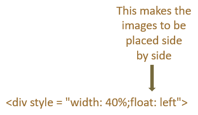
So, if you look at the above output, the images are placed side by side. And this is achieved using the <div> element and float property with the style attribute.
All we have done is used the float property and set its value to left with the style property of <div> element.

And the contents of the <div> elements(i.e. The images) are placed side by side.
<div style = "width:40%;float:left">
	<img src="image1.jpg" style = "width:100%">
</div>
<div style = "width:40%;float:left">
	<img src="image2.jpg" style = "width:100%">
</div>
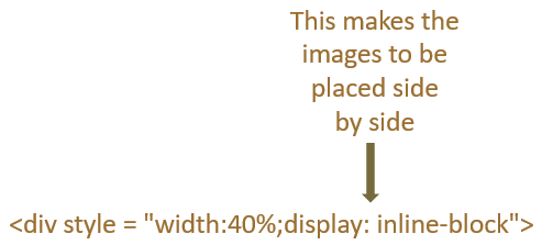
The images can also be placed side by side using the display property of the style attribute.
Again to place the images side by side, we need to set the value of display property to inline-block.
<html>
	<body>
		<div style = "width:40%;display:inline-block">
			<img src="image1.jpg" style = "width:100%">
        </div>
		<div style = "width:40%;display:inline-block">
			<img src="image2.jpg" style = "width:100%">
        </div>
	</body>
</html>

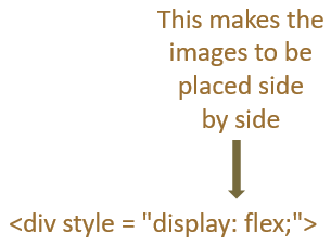
The display property also has a value called flex, which will help to place the images side by side. And all it needs is a parent <div>.
Confused? Let us clear with the below example.
<html>
	<body>
		<div style = "display:flex;">
			<div>
				<img src="image1.jpg" style = "width:100%">
        	</div>
			<div>
				<img src="image2.jpg" style = "width:100%">
        	</div>
        </div>
	</body>
</html>
So, in the above example we have used two <div> elements that contains the images.
<div>
	<img src="image1.jpg" style = "width:100%">
</div>
<div>
	<img src="image2.jpg" style = "width:100%">
</div>
And taken the above two <div>'s and placed them inside another <div> or parent <div>.
<div style = "display:flex;">
	<div>
		<img src="image1.jpg" style = "width:100%">
	</div>
	<div>
		<img src="image2.jpg" style = "width:100%">
	</div>
</div>
Now, the <div>'s with images are inside another <div> or the parent <div>. And the parent <div> has the property display whose value we have set as flex. And setting the value of display to flex makes the images displayed side by side.
